
Workflow Step Analysis
For one workflow, where does the time actually go?
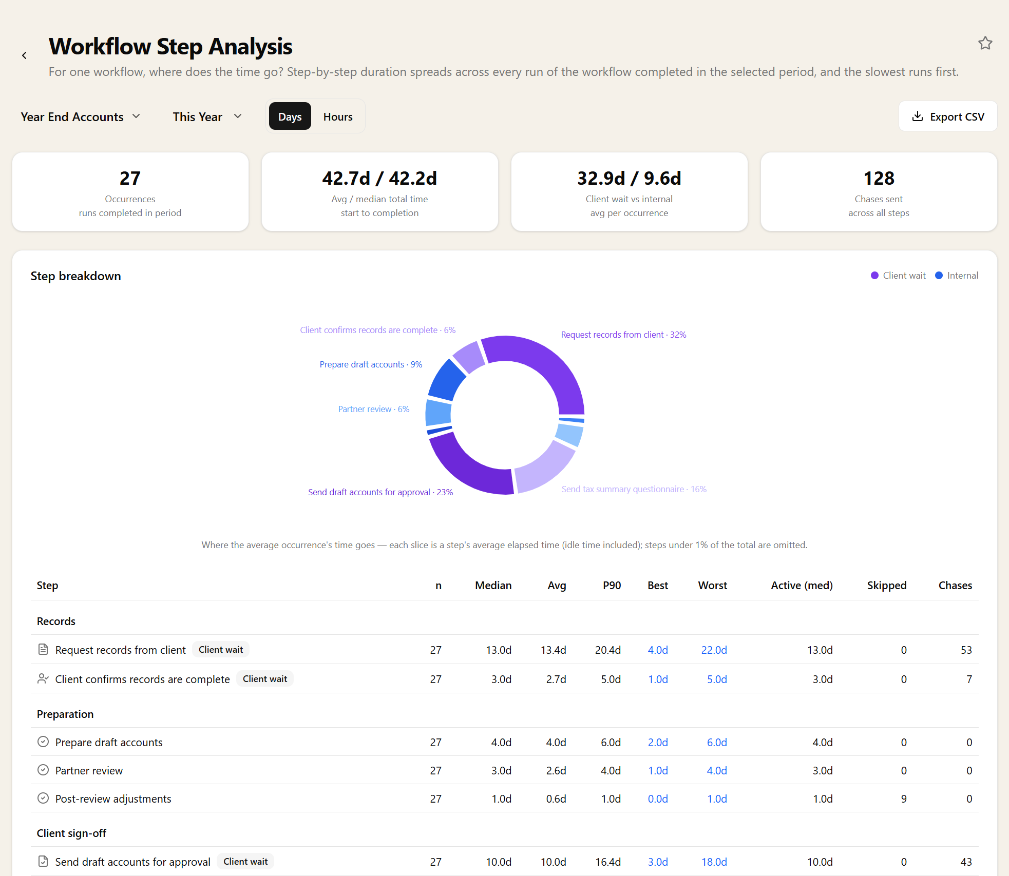
Pick a workflow and see it step by step: duration spreads across every run completed in the period, with the slowest runs ranked worst-first.
Spreads, not just averages
Each step shows median, average, p90, best and worst. That combination matters more than an average alone: a step with a two-day median and a fourteen-day p90 is not a slow step, it is a step that occasionally goes badly wrong, and those are two different things to fix.
The outlier tasks behind any number are one click away, so a suspicious figure leads straight to the specific jobs that caused it rather than to more aggregation. The best and worst run of every step are named outright, which is usually the fastest way to understand what a bad one looks like.
Elapsed time and working time
Steps report elapsed days and active days separately. Elapsed is the wall clock; active strips out the stretches where the step was sitting with a client. A step that takes eleven elapsed days and one active day is not slow work, it is a waiting room, and no amount of internal process change will speed it up.
Each individual run is broken the same way — total elapsed, client wait, internal — so you can see the split on the worst offenders rather than inferring it from an average.
Steps that get skipped, and steps that get chased
Every step also carries how many times it was skipped and how many chases it generated. A step skipped on most runs is a step your workflow does not really need, and deleting it is the cheapest process improvement available.
A step generating a lot of chases is the opposite: it is doing necessary work badly. That is usually a wording problem in the request or a step pointed at the wrong contact, and both are quick fixes once you know which step to look at.
Redesigning a workflow with evidence
Most workflow changes are guesses about where the friction is. Running this before and after a change tells you whether moving a step, splitting it, or automating it actually did anything — and which step to look at next.
It is also the report to open before you roll a workflow out to more clients. A step that costs an extra three days on twelve jobs a year is tolerable; the same step on two hundred jobs is not, and that is a decision worth making with the spread in front of you.
Filtering, drilling in, and getting it out
Choose the workflow and the period, and the report covers every run of it completed in that window. The occurrence list underneath ranks those runs worst-first, so the slowest jobs are already at the top rather than something you have to sort for.
Export the step table to CSV to compare two versions of a workflow side by side, or query it through the MCP server.
Related reports
These answer the question next door. If this report tells you something is wrong, one of them usually tells you why.
Related features
The parts of Sodium this report reads from — set these up and the report fills itself in.